

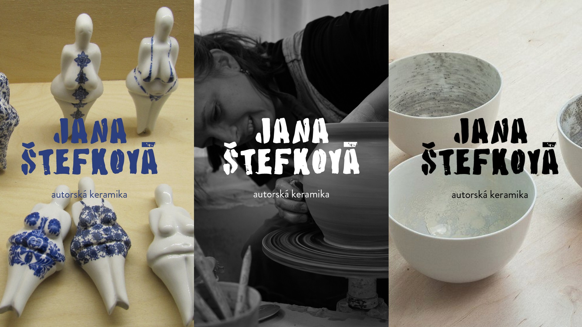
Jana Štefková
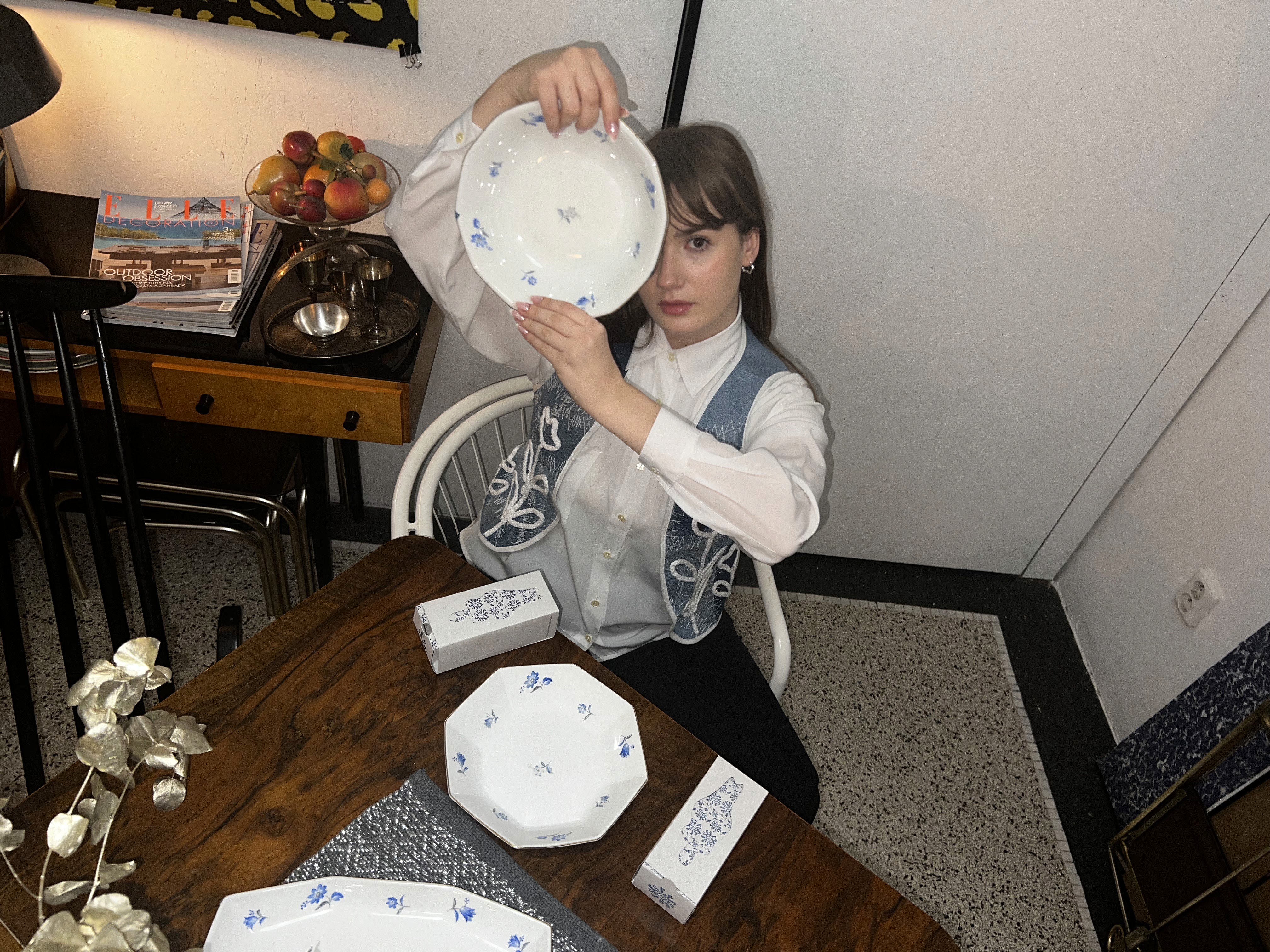
Jana Štefková is a Czech experimental ceramic artist known for blending natural materials—like ash—into her pieces, giving them symbolic new life. My goal was to create a visual identity that reflects her craftsmanship and supports the promotion of her work. The core of the identity is a custom typeface inspired by her handmade process. I began by exploring blurred chalk lettering based on her initials, evoking the textures of ash. Eventually, I shifted to linocut printing—creating and digitizing letterforms that could also function as stamps, usable on packaging or directly on ceramics. Each print, like her work, is unique. The stencil-style typeface reinforces this individuality. I paired this handmade font with Battery Park (as a reference and inspiration) and Brandon Grotesque for supporting text. The contrast adds both structure and softness to the visual language.
Completion Date
January 2024
Category
Visual Identity & Branding & Packaging Design
Sector
Original ceramic creation


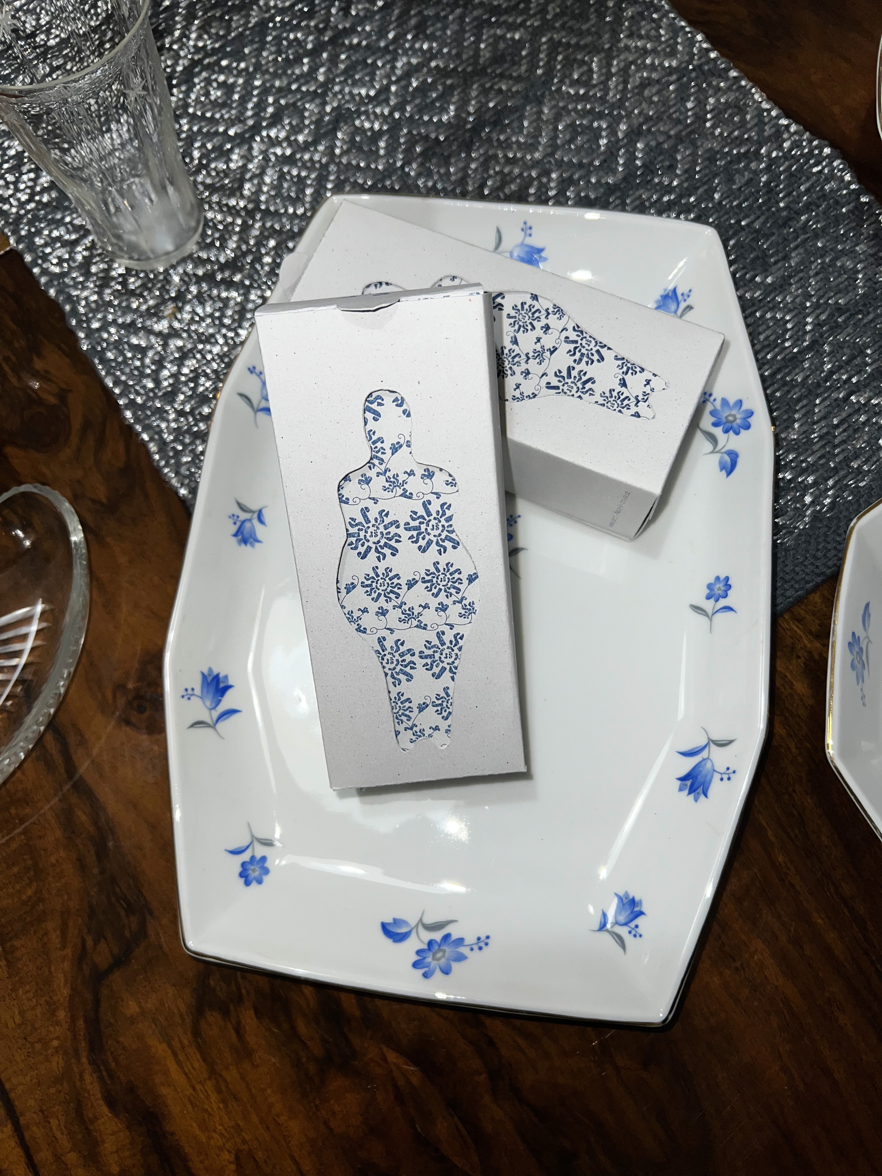


Packaging design focused on one of her best-known pieces—the ceramic Venus, a reimagining of the ancient female archetype. The box structure was custom-designed to fit the sculpture, featuring a cut-out silhouette on the front, revealing a floral-patterned inner lid. The floral motifs echo those Jana uses in her own work and were also developed from linocut symbols. The packaging uses earth tones with touches of blue, printed on recycled grey-toned paper—thick enough to protect the sculpture while aligning with her sustainable values. The final logo uses imperfect linocut lettering to reflect her tactile, handmade approach. A shorter monogram version is also available, both optionally paired with the phrase autorská keramika.
